Access Software Insights
Overview
The Access software insights report is available to all customers with access to AI Assistant Insights. You can access this dashboard by accessing the plugin insights present in the analytics application on the navigation sidebar. It gives you a quick view of how this plugin has been performing corresponding to the employee queries.
Users with a “Bot analytics admin” or “Bot analytics viewer” role for the analytics application can access this report. Please add the users using the Roles and Permissions tool if they cannot see this report under the AI Assistant insights tab.
Key terms used in this dashboard
| Key terms | Definition |
|---|---|
| Interactions | All user utterances sent to the AI Assistant, button clicks in the AI Assistant's responses, link clicks in the AI Assistant's responses, file uploads for the Brief-Me plugin, and form submissions are defined as interactions. |
Filters and widget types
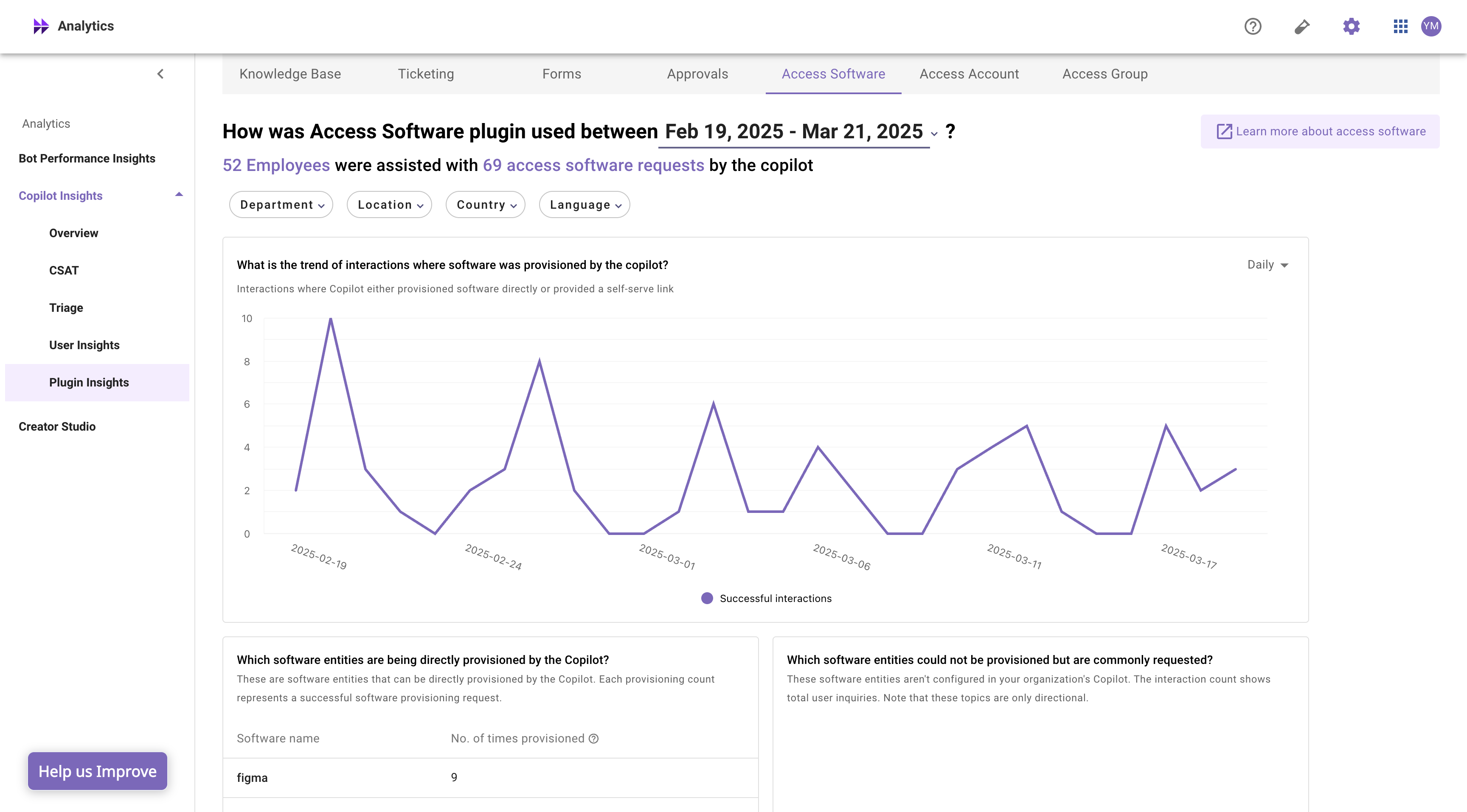
The access software insights report allows you to filter for a selected time period, department, location, country and based on user preferred language.
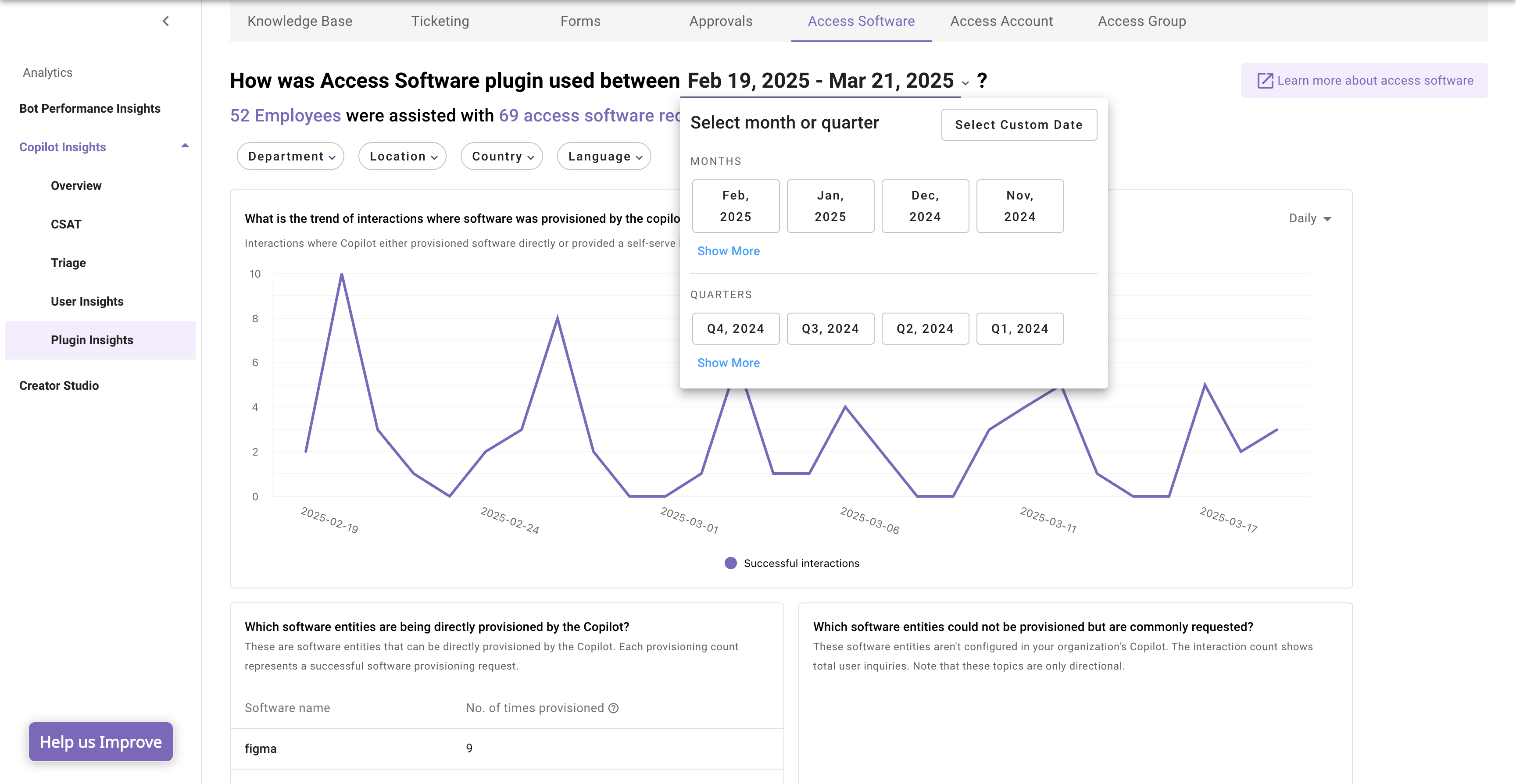
Select date interval for which you want to review the served content details
By default the dashboard show access software plugin performance for previous 30 days. This can be changed using the date interval selection. You can select previous months (or) quarters using the selection available in the dropdown.
The dashboard also allows custom date interval selection. You can access that using the “select custom date” button.
Please note, if you are choosing custom dates, the report data will be projected up to one day before the chosen end date.
Select department/ location/ country/ language for which you want review the served content details
Access software insights report provides 4 top level filters which can used to filter the data.
The department/location/country value is ingested from your external system used in user identity. Please refer here to learn more on user identity ingestion.
Widget types used in this dashboard
- Trend chart
Line chart or Bar chart that presents the values of one or more metrics over a period of time, with selectable time intervals (day, week, month). For example: trend of active user over a selected time interval.
The day, week, month breakdown is only visible for a selected time interval.
| View type | Minimum time interval | Maximum time interval |
|---|---|---|
| Daily | 1 Day | 30 Days |
| Weekly | 2 Weeks | 26 Weeks |
| Monthly | 1 Month | 24 Months |
- Table
A tabular list of one or more dimensions and their metrics.
Deep dive into widgets
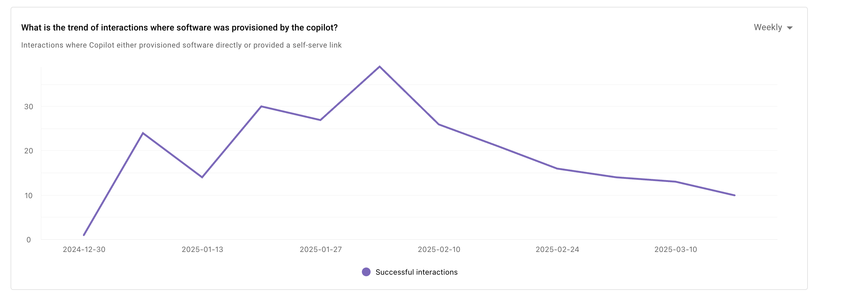
Trend of softwares being provisioned
This widget provides the trend of interactions where an access software plugin was successful. These are all the instances where the AI Assistant provisioned the software or provided a self-service link for it. (Depending on what has been configured)
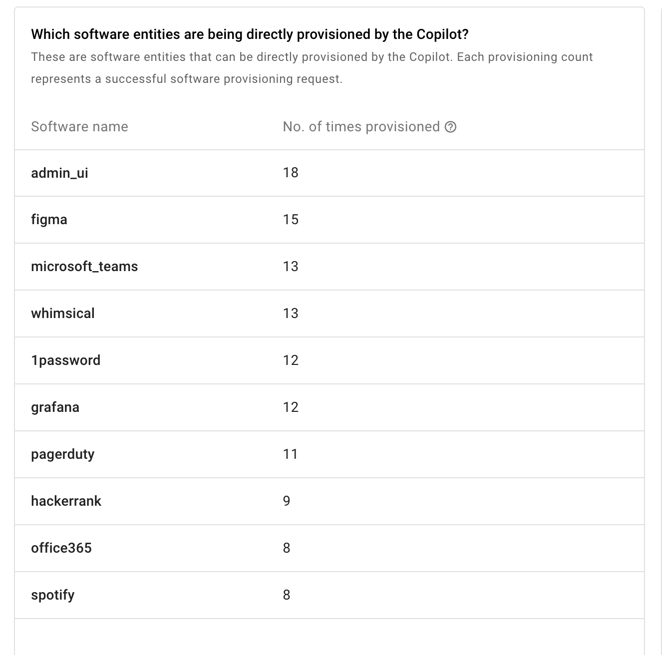
All softwares that were provisioned by the AI assistant
You can sort this widget in ascending and descending order based on a column by clicking on the widget's top right sort button.
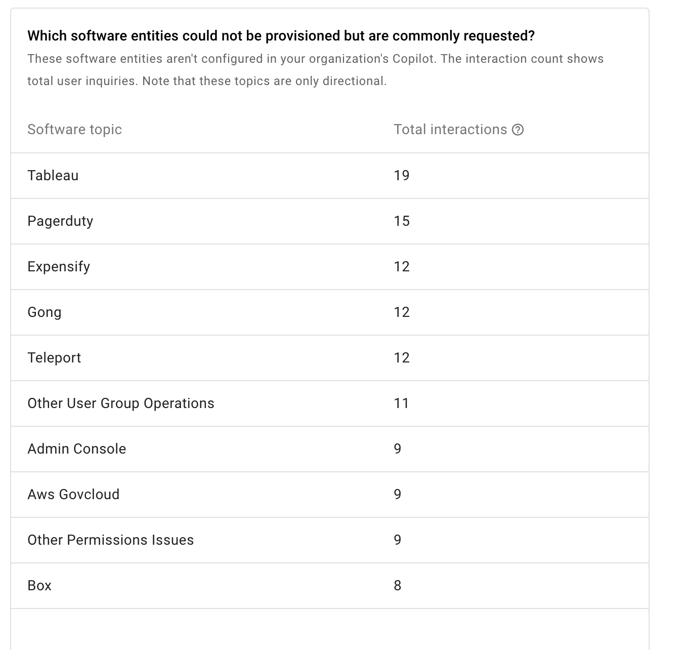
Potential software configuration gaps
These are all the instances where users asked for a software access but the AI assistant was not able to provision the software.
Updated 5 months ago